Cofertility
Super Keen Studio, 2025
Scope
Brand architecture
Nomenclature
Visual identity
Art direction
Credits
Strategic direction—Lauren Wong
Creative direction—Gabby Lord
Motion design—Julia Winkler
Logo refinement—Dave Foster
Description
From Super Keen:
Cofertility is changing the way we think about family-building. We worked with the team on brand architecture, nomenclature, and an evolved visual identity.
We started brand architecture by assessing how their brand worked today. We helped the team align on a masterbrand architecture that pulled the two sides of their business closer together and under the larger umbrella of Cofertility. Our brand architecture affected nomenclature, which is the systemic way the team names the products and services they offer. We moved forward with a naming structure that reinforced how all of Cofertility’s services fit together. It also created a clear system for future products and services down the line.
We helped the Cofertility team think through all kinds of brand architecture implications, from social strategy for their three accounts to website information architecture. The team felt much clearer about what needed to go where—a huge benefit of having a brand architecture everyone felt great about.
Finally, we evolved Cofertility’s existing visual foundation to reflect this new masterbrand architecture. We brought more balance and legibility to the wordmark and the typefaces. We created an icon called the “Burst” that connected to Cofertility’s existing brand strategy. We expanded the color palette to leave room for future offerings and optimized it for the channels it shows up in. And we showed how the two sub-brands could adapt parts of the system in meaningful ways, from the icon to the colors.
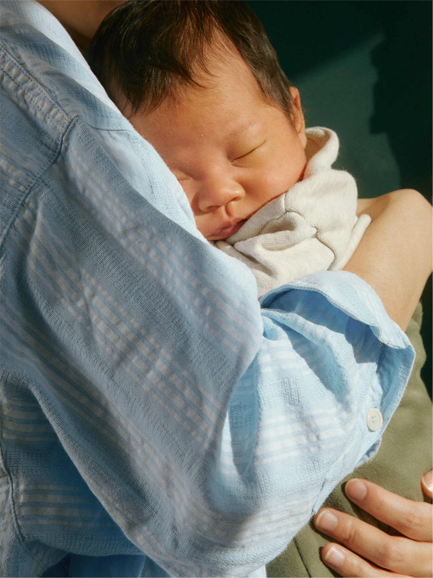
Art direction was one of the biggest ways we evolved the brand system and thoughtfully differentiated the sub-brands. For Cofertility Freeze, we helped the team explore photography that focused on the individual—especially ones that showed how different their journeys with egg freezing or family building could be. For Cofertility Family, we showcased the real diversity of intended parents looking to build families.
The final result is an inclusive idea of family-building that avoids heteronormative imagery and language that has historically framed fertility around absence or a lack of something. We focused on clarity, not reduction. Every touchpoint was designed to make a deeply emotional and sometimes clinical process feel more human, without ignoring the hard parts.